The Production Design of Modernism
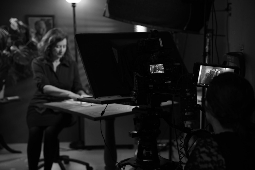
When we began filming the core segments for our Modernism course, the production team knew that we wanted to move beyond the one-note aesthetic of previous edX Poetry in America modules. We wanted to marry our visual approach to the mold-breaking spirit of Modernist poets themselves. Because the structure of the videos themselves wasn’t something we could experiment with, we turned to production design to explore the individual tone of each week.

Each week of Modernism is visually distinct: everything, from the motion graphics giving life to poem text on-screen, right down to Lisa’s wardrobe, is designed to reflect the themes and styles of the poets discussed, both aesthetically and symbolically. Compare the introductory videos below. The first features a minimalist (and somewhat austere) set created for our week on Robert Frost. The second showcases a Film noir-inspired cityscape designed to transport the viewer to the Chicago of the 1920s and ’30s.
https://youtu.be/BwyEQgWDb0E
https://www.youtube.com/watch?v=6uupgPQctq8
If you’d like to see more, sign up for Poetry in America: Modernism to check out this series of unique visual palettes! The course is currently running, and enrollment is open through early June of 2016.
-Aaron
